

those guys have truly mastered the art of fusion cuisine. one place i used to frequent served a döner kebab four-cheese pan pizza with french fries on top.
then there’s of course the infamous Calskrove.


those guys have truly mastered the art of fusion cuisine. one place i used to frequent served a döner kebab four-cheese pan pizza with french fries on top.
then there’s of course the infamous Calskrove.
this guy has never been in a genuine swedish pizzeria run by a hardworking guy from the Levant. that’s true pizza.


i have over 300 hours in farming sim 2015. i bought the deluxe edition. got a little model tractor and a keychain.
i… don’t know.


hm, wonder where i got rosatom from then. i remembered there being something in the papers about it at least…
they’re building a particle accelerator. the HLC.
probably. the actual demographics shifts don’t make it over here, only the final numbers.
bastard used to be great when it was just one restaurant. went there a lot in uni. then they got popular, and while i haven’t been to the original place in like five years all their new locations are just… expensive and average.


it’s also built by a subsidiary of rosatom, if i’m not mistaken
this doesn’t match my experience at all.
i have no idea what the strategy of the us democratic party was, I’m just reflecting on what i’ve on social media over the past month or so (a constant barrage of “don’t vote third party”) and comparing it to the results (very few people voting third party). of course there’s no way to know how much of that was due to said barrage, but we can for sure say that the people telling people to vote third party failed.
but like… if everyone is saying “don’t vote third party”, and the amount of third party votes significantly drops as a result, isn’t this what the result would look like?


explore the island you got stuck on. look around for details. sit down and watch the spectacle until you can continue. there’s no rush, and no such thing as wasted time.
or to be more prosaic, you go back home automatically after a short while anyway. not only that, every island gets thrown around by the storms periodically, launching them clear out of the atmosphere every five minutes or so. it’s just a matter of observing your surroundings, and something will happen.

I use a french press and endeavouros. don’t know what that says…


it’s weird that. it’s obviously possible to have a flat-shaded skeuomorph, just look at basically all of windows 95, but for some reason we connect them to this particular graphical style. files and folders are both part of the old classic “desktop metaphor”, so they basically have to be skeuomorphs. but like, the application icons are basically just mosaic tiles of the normal icons.
a proper skeuomorph would indicate what the program is for. krita and whatever map software that is are both good, if a little flat. but the libreoffice suite just being squares with a letter on them? have them be like, a spreadsheet for calc, a stack of cards for impress, and a printed page for write.
remember all the icons for windows 95 network utilities that have people in them? those are also (attempts at) skeumorphs because they’re trying to communicate what the program does.


a skeuomorph (from greek, “tool/container-shape”) is something that retains the characteristics of another thing that it is based on, even though those characteristics are no longer useful. think lamps shaped like candles, or the floppy disk save icon, or media player programs with volume knobs.
skeuomorphic UX is a good way to get users comfortable with a system by using designs they are already familiar with, and the original iphone used this to great effect.
This is a good example of skeuomorphic UI:
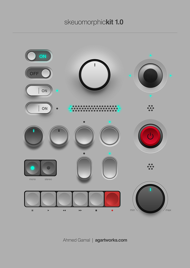
all to say, I’m not entirely sure these icons are skeuomorphs. they’re just glossy.
it looks sort of like a continuation of the beaker browser project. basically, a peer to peer browser that also serves content you have made to others using the browser. it’s a cute idea.
this reads like a teenager wrote it
cryptid club is also by Sarah, she advertised it on her page.
i use a Kobo Clara HD. It runs linux out of the box, the system memory is on a removable SD card inside the case, and the user account is defined in an SQLite database on disk. If you add an empty user account to the database, it removes the “create account” screen and disables any Kobo online services. Then you can install KOReader and upload files over USB as everyone else has said.