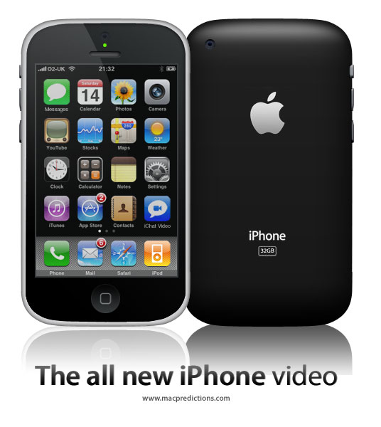
I don’t know about all of you, I don’t like these new flat icons that everyone is using. What ever happened to the old icons, like on iPhone and Samsung they used to have them years ago. Those were good times. Now it is always these stupid boring cartoonish designed icons. Side note: Somebody please update this icon pack. I am trying to use it on xfce on arch but some of the icons aren’t working properly because it hasn’t been updated in a while. I’ll donate to you right away if you do it. Link to the repo: https://github.com/madmaxms/iconpack-obsidian
It’s nice and easy on the eyes. I conjecture that glossy and matte (as seen here) styles of skeuomorphism gave way to more abstract design since:
- Skeuomorphism is hard to get just right without being excessive and tacky
- Saturated, simple blocks of color pop out more, particularly on the increasingly prevalent mobile UI
- And thus also have better shelf appeal
If it were up to me, the red line would be when buttons and interactive elements are indistinguishable from text. The stock Android settings is probably among the worst offenders in this regard.
What I really miss is light mode that isn’t hated for blinding users and dark mode that doesn’t plunge the user into the void. Those “toolbars” look lovely, perfect for any lighting condition or time of day. I’ve yet to understand why, at present, designers insist on pure white everywhere when it comes to light mode. Maybe everyone is using the night light filter so it doesn’t matter? At least pure black dark mode makes sense for power efficiency on OLEDs.
Skeuomorphism is hard to get just right without being excessive and tacky
that was always my impression of os x back in the day. it felt tacky as hell. i’m a linux guy, but windows’s aero was so much more beautiful
Actually no, I hated the Vista era UI design. Linux themes were positively garish, add MacOS looked like a candy store. CDE greatly impressed me back then. It looked like it was made by adults for adults. Highly legible, and the pastel colors are being emulated by Solarized.
I’m sure that those UIs were a product of the times. The 90’s and noughties were loud and colorful and exciting and everything looked like a comic. Now that we live in more depressing times, we can look to the science of perceptual psychology.
You see, we have an attention budget, we need to process what we see. Visually complex UIs need to be parsed, and that takes mental effort, and that robs us of mental energy to focus on our work. It’s not a crippling effect, but it’s there.
Look at street signs and corporate logos, they easily lodge in our mind. Effective advertising has a clear and simple visual language, and this is what UIs should strive for.
Effective advertising has a clear and simple visual language, and this is what UIs should strive for.
Interfaces can be needlessly complex regardless of being flat or skeuomorphic.
But flat interfaces still require mental effort to parse. Especially when the interface is complex and/or crowded and you’re trying to pick out active UI elements amongst decorations like group boxes/panels.
Essentially, flat interfaces are currently popular because of touchscreen devices. Touchscreen devices have limited space and thus need simplistic UI elements that can be prodded by a fat finger on a small screen.
But I don’t need a flat touchscreen-friendly interface on my non-touch dual 24" monitors with acres of screen real estate. I need an interface that nicely separates usable UI elements from the rest of the application window. That means 3D hints on a 2D screen, which allows my monkey-brain with five million years of evolved 3D vision the opportunity to run my “click the button” mental command as a background process.
You see, we have an attention budget, we need to process what we see. Visually complex UIs need to be parsed
One of the reasons i like interfaces with clear lines. But that doesn’t fit icons, all-same-isch looking rectangles are not easier to parse than “objects”. The mind is optimized for 3D, not for abstract icons.
I am a papirus man

For those who haven’t seen snl’s papyrus skit:
https://www.youtube.com/watch?v=jVhlJNJopOQ
Or papyrus 2:
https://www.youtube.com/watch?v=Q8PdffUfoF0
A couple of the best sketches SNL has ever done
I upvoted your comment just because it had links to the reference you made.
Also, the sketches were funny; thanks for sharing them.
Thanks, glad you enjoyed them!
Kinda, yeah! These kinda remind me of some of the icon packs I used on my jailbroken iPod Touch!
Yeah, I do miss that, but idk how much of it is nostalgia and how much is an absolute aesthetic preference. I think the main reason for the change though is Microsoft trying to make Windows work well on mobile devices though, meaning forgoing the aero and more expensive VFX.
Wish some DEs would make their default style more like a win7 era style. Would be nice to have the variety.
No reason they wouldn’t work on a small phone, especially back then

I like how tidy it is. But I do prefer to be able to see icon shapes at a glance with my terrible eyesight as it helps identify.
Yeah, I don’t understand flatness either. Neither I understand the dark themes either. My eyes and brain simply can’t do the separation easily, I spend more time trying to process an image. Old style icons and UI colors are the best IMHO.
I miss the time when not all icons were a rectangle or a circle.
I miss UIs having lines and clear separations between elements. I loath this new flat style that everything has to have now, where you can’t tell when one thing stops and another starts.
And you can’t tell when something is active/focused or not because every goddamn app and web site wants to use its own “design language”. Wish I had a dollar for every time I saw two options, one light-gray and one dark-gray, with no way to know whether dark or light was supposed to mean “active”.
I miss old-school Mac OS when consistency was king. But even Mac OS abandoned consistency about 25 years ago. I’d say the introduction of “brushed metal” was the beginning of the end, and IIRC that was late 90s. I am old and grumpy.
I’ve got these articles saved, about the history of brushed metal on Apple software: https://512pixels.net/2013/03/brushed-metal-intro/ https://512pixels.net/2016/11/the-brushed-metal-diaries-beyond-software/
To be honest I loved it … though maybe it has to do with the fact that I have a soft spot for 10.4 Tiger, due to personal (?!) reasons. After Tiger they started progressively tearing down the brushed metal components.
And you can’t tell when something is active/focused or not because every goddamn app and web site wants to use its own “design language”.
The FireTV os is worse. The active focus indicator is different between pages of the OS ignoring apps. Oh and it changes constantly.
I do miss them. But I’m happy with my custom
Suru++ Aspromaurosicons too.I miss the KDE 3.x crystal theme
The thing I’m more nostalgic for was the time when everything had to be a glistening amorphous translucent blob, a bit like the Cingular Wireless logo or the MusicMatch Jukebox logo. And I’m in that era where you can just play MSN messenger sounds and you’ll get an OH MY GOD out of me.
Frutiger Aero, I think.
I miss the Vista tingle and shine, and the sounds it had
It seems Nintendo’s consoles (Wii, DS, 3DS) were also more colourful and packed with music and sound then.
The Switch is so quiet. So… Dead?
Sort of. What that page describes is in the same building as what I’m thinking about.
I’ve had the MSN message sound as my SMS Ringer for years now. The looks I get from people are fantastic.
Sometimes I think that I miss skeuomorphism, but then I realize it’s not the skeuomorphism that I miss, but my childhood and days when the world was much simpler.
Would I like to bring back skeuomorphic UIs? Yes.
I’m too old to be nostalgic for skeuomorphism. But a retina-burning amber monochrome monitor, text mode, with menus and UIs built out of ASCII graphics, or at best, 640 x 480 CPU-driven graphics modes? Now you’re talking.
From my perspective, the skeuomorphic era of the early-late 2000s is still “modern”.
Ha, you and me both buddy, although I like retina burning green :). Let me know what you think of my personal profile site: www.gradyp.com, made it just for the graybeard aesthetic.
How do I type something? There’s a cursor but keyboard input doesn’t work for me. You oughtta make it do some dummy commands for fun, or better yet, some real ones in a sandbox, that’d be neat, for fun user interactivity. Otherwise, looks slick. Good job.
Yeah, entirely fake. But yes, you read my mind, I plan on adding some fun interactivity someday. Plan on some fake terminal commands like ping and so forth.
Thanks for the feedback!
Ya I feel you, I remember I had an iPod when I was a kid with the icons I think it was iOS 6. Now when I try to find skeuomorphic icon packs on Linux it is almost impossibile and the ones you do find are abandoned ☹️
Quick info, the link does not work. You need to put it in the address part aswell (like this
[https://github.com/madmaxms/iconpack-obsidian](https://github.com/madmaxms/iconpack-obsidian)Here is a working one https://github.com/madmaxms/iconpack-obsidianOkay thanks never made a post with a link
i actually hate icons with like shading or 3d look. but I don’t really use icons anyway, the only icons i see are in my system tray and when i run wofi


