- cross-posted to:
- movies@lemmy.world
- cross-posted to:
- movies@lemmy.world
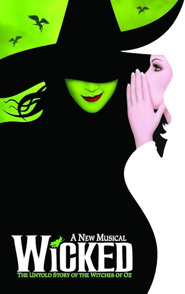
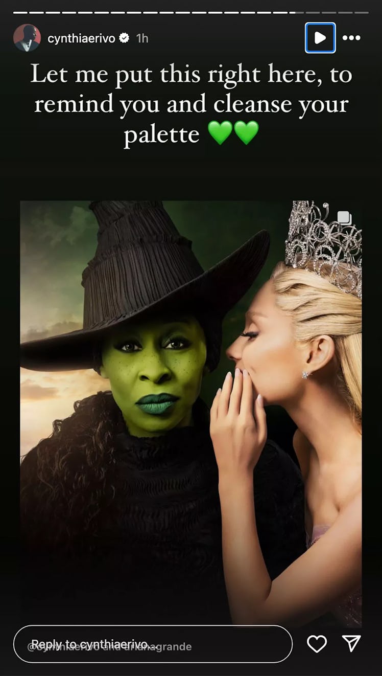
Fans customized the Wicked movie poster to more closely match the original Broadway poster.
Original Broadway Poster:

Movie poster:

Some fans, disappointed by the poster, altered it to be closer to the original, moving Grande’s hand and lowering the brim of Erivo’s hat to cover her eyes. The edits prompted Erivo to respond. “This is the wildest, most offensive thing I have seen
“None of this is funny. None of it is cute. It degrades me. It degrades us,” Erivo continued. “The original poster is an ILLUSTRATION. I am a real life human being, who chose to look right down the barrel of the camera to you, the viewer… because, without words we communicate with our eyes.”
So, this seems like a completely reasonable reaction to fans making fan content.


I prefer the original poster. The new poster still looks like Wicked to me, and I would be disappointed if it recreated the original exactly. The fan edit is fun, I like it, but I understand artists from current year who made the modern poster would want to make a statement different than artists from when the original came out.
Everyone is making art, why do we have to be mad about that?